Web Style Guide
Home » Web Style Guide
Headings
Heading Structure
Think of each webpage as a book. The H1 tag is the book’s title. The H2 tags are the chapter titles. The H3 tags are subsection titles within each chapter. And H4 tags divide H3 tags even further if needed.
Select the heading element on the page. In the Content section, change the HTML Tag to the appropriate heading tag.
Best practices and tips:
- Use the heading tags for structure, not style.
- The H1 tag can only be used once. It should be placed in the gradient bar at the top of each page.
- There can be multiple H2-H6 tags on a page.
- Headings must descend in order. You cannot skip from H2 to H4.
- Use the outline feature in Google or Word docs to help visualize the structure.
Example of proper structure:
- H1 – Types of Food
- H2 – Fruits
- H3 – Apples
- H3 – Berries
- H4 – Blueberries
- H4 – Strawberries
- H2 – Vegetables
- H3 – Beans
- H3 – Tomatoes
- H2 – Fruits
Heading Style
Select the heading element on the page. Under style > typography, click on the globe icon and choose the appropriate heading style. In most cases, the heading style should match the heading tag.
Examples of heading styles:
H1 Heading
H2 Heading
H3 Heading
H4 Heading
Text
Regular Text
This is a P tag styled as regular text. Use the regular text style on almost all paragraphs through out the website.
Caption Text
This is a P tag style as caption text. It can be used to style text under photos, breadcrumbs, footnotes, etc.
CTA Text
This is a P tag styled as CTA text. It should only be used in the CTA section at the bottom of each page.
Text Links
Always underline links in blocks of text. This also applies to links that appear in lists and “Read More” links that follow post excerpts. Read this article to learn more.
Buttons
Primary Button
The primary button should be used for the main CTA on each page. It does not have a shadow. The shadow version (see global buttons) should only be used in the gradient CTA at the bottom of each page.
Global Buttons
Global button widgets can be used when additional buttons are needed. Use the secondary button for links other than the main CTA. The tertiary buttons should be used for links that fall under the secondary section or when a series of buttons is need.
The shadow version of the primary button is also global widget and should only be used in the gradient CTA bar at the bottom of every page.
How to use:
- Drag the button into a container.
- Unlink the button.
- Under content, change the text and add a link.
- Under style, in the normal state only, change “color” if the container background is not the same.
For the gradient CTA bar
Images
Use the global image widgets when adding images. The version without a border should be used on white or dark backgrounds. The border version should be used on light backgrounds.


Layout
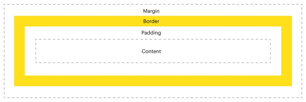
Margin
Margin is the space outside an element.
Margin is used to adjust the location of the element on the page.
Avoid using negative margin when padding would be more appropriate.
Padding
Padding is the space inside an element.
Use padding to adjust the distance between the content and the element’s border around it.
Use padding to add space around an item without changing it’s alignment on the page.
Use padding to add space at the top and bottom of a section.

Containers
Flexbox vs Grid
Elementor is moving away from the grid layout to the new flexbox layout. The flexbox webpage code is simpler and reduces load time. Flexbox is better for responsive design. Flexbox allows you to easily adjust the space between elements in the same container using gaps. When creating new sections, choose the flexbox layout.
Call to Action
This bar should only be used at the bottom of each page for the most important CTA.
Call Today For A Complimentary Consultation
Call 800-774-5516 to connect with a specialist who can review records, advise your family on funding and next steps and answer any questions you may have.


